Adoptsemantic designto get your point across
1. What’s a visual identity?
2. The value of design semantics
3. Fastlane’s methodology
Have you ever noticed how some brands have a real visual strength that immediately sets them apart from their competitors? Whether it is through their logo design, their style or even a colour, these brands have managed to create a strong and recognisable visual identity.
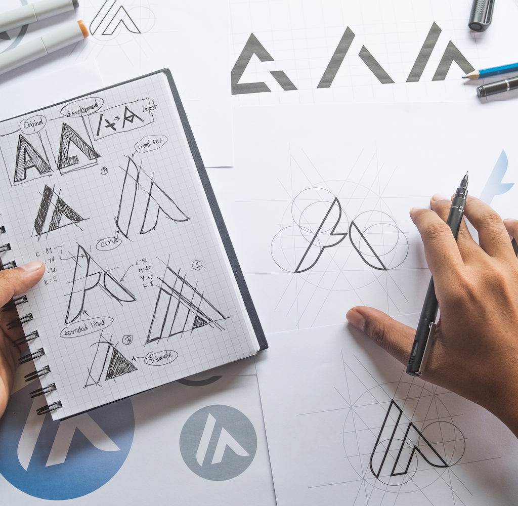
At Fastlane, we strongly believe in design semantics, that is, the creation of visual identity symbols that coincide with the values of your business or organisation. It’s very much an evolution of how designs are created: instead of resorting solely to gut feeling when making important design decisions, we will strive to also convey meaning by means of colours, shapes and symbols. Our design choices are informed, audience-based and value-based.


What's a visual identity?
A visual identity (also commonly referred to as visual guidelines) defines the key elements of your visual identity such as the logo, typography, colour palette and base templates for communication materials.
A visual identity has two main purposes: laying out the key elements of your visual identity, and accompanying your staff and contractors in their work so as to avoid inconsistencies and misuses of these elements.
The visual identity usually comes in the form of a booklet that describes a brand’s visual universe and clearly states what is and what isn’t allowed. Longer-form brand kit also includes templates for common communication materials such as Word and PowerPoint templates, email signatures, newsletter, etc.
The value of design semantics
In the era of logo generators, AI-based designs and overexposure to attention-seeking visuals, conveying true meaning with informed designs has never been so important.
Over the past few years we’ve seen more and more brands put style and sobriety over meaning when making decisions about their logos and visual identities. Is the result good-looking? Sure. But does it leave a mark? Probably not, and that’s not likely to improve.
Like all other branding aspects, a brand’s visual identity is about differentiation, personality and emotion. With a design semantics approach, you can make sure to thick these three boxes and create a branding that speaks to your audiences. It’s about conveying tangible meaning and moving your audiences without necessarily resorting to verbal or written communications.


Fastlane's methodology
At Fastlane, we follow a methodology that encompasses the definition of your organisation’s objectives, a competitive analysis and an assessment of target audience characteristics. From thereon we use design semantics principles to create or redesign your logo, establish key elements of your brand kit and create your future templates.
With our approach based on in-depth analysis and long design expertise, we create a tailored brand kits that reflect your company’s unique identity catch your audiences’ eye.
1. Definition of objectives, audiences and values
2. Competitive analysis
3. Logo creation / redesign
4. Core brand kit elements
5. Templates
6. Brand kit booklet
Let's talk!
Want to know more about our agency? Schedule a call with us so we can introduce you to our work and, most importantly, talk about the challenges you face or help you need.
Just got inspired?
Use our online quoting system and get a ballpark estimation for your project.
© 2023 Fastlane.
